


Microinteraction is a definite, tiny action of your application’s interface Saving, volume setup, incoming letter sound, “Loading…” progress indicator, tweet sending, anything at all. The more competitors you have, the more it’s important to have cool microinteraction features. But still, the fewer of them, the better — they should exist only for common aim’s sake.
A trigger is some prominent icon for one microinteraction, for example, a close window button or «Home» button on a smartphone. In the majority of cases, it’s just a banal button. Action can’t be modal (various) otherwise it’s not a trigger.
It’s great if a trigger shows what’s happening with a trigger right now. For example, before entering a cart, we see how many goods are there.
Triggers may be invisible. E.g.: smartphone gestures, Siri or «ok, google, ..». Invisible control elements should be detectable as far as possible. For example, you can detect a list update while trying to scroll it higher than the first element.
What is the role of triggers?
Affordance is a case when trigger-icon is similar to what it does. Just the way shopping-cart in an online-shop is similar to a cart in a supermarket. Icons should be identical to the real-life objects or be well-known to users. I.e. it will be a hindrance to usability if you make a super creative checkbox where instead of a tick something incredible happens.
You should better avoid text in the interface if everything is pretty clear without it. The right icons will perfectly do.
Use already existing triggers for sending a new message. There’s no need to create new ones. Let’s assume you need to say that registration for World Usability Day will start on a particular date. Organizers must have written it right on the registration button.
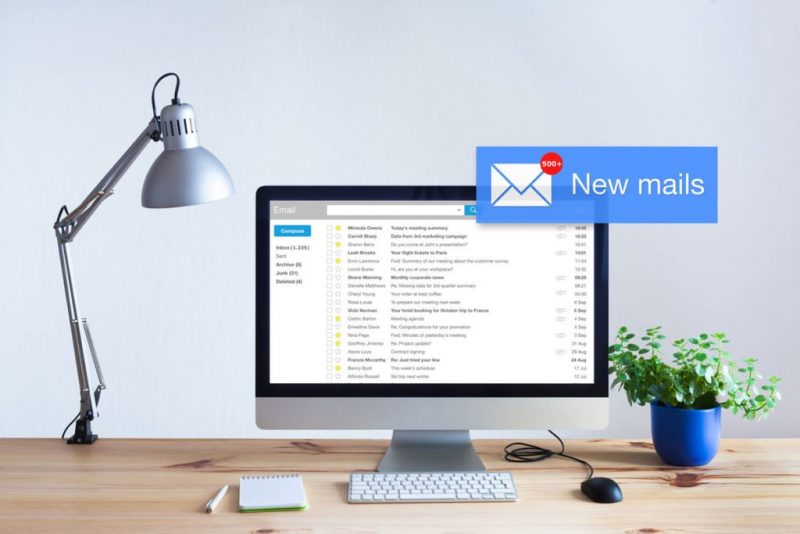
More and more triggers aren’t user ones anymore, they’re initiated by a system — for example, push-notifications about new letters — trigger itself is watching updates so you don’t need to check anything. Or deeming display due to being inactive for several minutes.
Now you know that all these simple and evident things are called microinteraction and their triggers. Maybe it’ll be easier to explain yourself with colleagues.
Other notions
- Regime is a special state of an app when its work differs from a regular state where, for example, tapping a button may lead to a non-typical result. It’s not good as users make mistakes. It should be visible what regime is on and changing the regime should be easy as well.
- One-time regime — a variant that minimizes the harm of the regimes. For example, we turn on «alarm clock» (where habitual gestures may not work) and take out the «regime» at once – the screen shuts down at the same moment when a user has changed the time.
- The cycle is a repeating command or a succession of commands. For example, “receive data every 30 seconds” and “send a notification in 10 days”. A cycle may be used in order to limit action time. For example, to end an online banking session to provide its security. Or help offer for a user who has stuck on the web site. The recurring use of a player may take into account the last volume setup.
Feedback
- Give your user a feedback, a response, react to his/her actions. For example, Boxee logo changes to a sad face when there’s no internet connection and Threadless shopping cart smiles when there are goods in it.
- Feedback should include humor — Dropbox offers to have a snack if upload takes a lot of time. Siri jokes when asked “What’s the sense of our lives?”. Someone shows cats when the site is down. In Warcraft 3 every fifth clicked on a character made him say something funny and if you click numerous times on a sheep, it exploded.
- Feedback should depend on context, for example, the volume should be decreased during the night.
Animate
- If visual feedback is shown far away from the place where action takes place, you can draw attention to it by a movement (it may be gradual appearance). In order to understand where you can proceed to checkout, you may make an animation of the goods flying to the shopping cart area.
- Even animation should be informative. For example, network connection spinner rotation speed in iPhone depends on the network speed.
- The animation should also be short. Here’s a good rule — make animation two times shorter than you expected. You may speed up the result if possible.
Sound and vibrate
- Time of brain reaction to sound feedback is essentially higher than to a visual one.
- Imitate real sounds. Switching should happen with a click-sound, not with the sound of a harp. It’s called sound icons.
- Don’t use similar icons for different actions.
- Vibration isn’t very efficient — tactile feedback is only able to transfer 1% of sound information. The majority of people can distinguish just 3-4 vibration levels.
You’re wrong!
One of the most widespread feedbacks is an error message. It’s a shame! It would be better if there were more positive feedbacks.
There are good thesis examples from Jef Raskin which state that if a user sees an error message, it means you’ve designed interface wrong: you may connect the lightning cable in iPhone using any side you want (unlike USB) and Gmail notifies in advance that there’s no mentioned attachment in the letter — you’ve written about something «attached», but there are no attached files.
Errors should be shown only in cases when system itself can’t fix them. For example, Meetup automatically widens the search radius, if the chosen radius has nothing to offer.
But sometimes errors “teach” a user. It may happen but the key thing here is that consequences should be harmless — a dishwasher won’t open if you try to do it and won’t hurt you but only starts twinkle.
Don’t use negative words like “error” or “warning” in the feedback.
Don’t use personal pronouns. A phrase “Wrong password” is better than “You’ve entered a wrong password”. But it would be better if you make an accent on an action: “Enter a password one more time”.
Spy on users
There’s no need to start from scratch. Always ask yourself — what do I know about users before the beginning of the microinteration? Platform, device, time of the day, location…
Threadless at once shows the user whether delivery is possible on the basis of location. Dropbox shows different upload instructions depending on the user’s browser. In a game Kingdom Hearts on PlayStation2 characters can discuss another game you’ve played as they see other game savings on the device.
The interface should gather information and adapt itself. For example, in the “alarm clock” app: if a user hasn’t used the Snooze button, it’ll delete it from the interface or will offer a user time, if he has used it 3 times already.
Various
- In instructions “For switching sound off saying “Yes” is more preferable than “Say “Yes” for switching off the sound”.
- Take it all on yourself, show the user maximum prepared result. Don’t offer them a wide choice, don’t let them make decisions, lead them visually through a narrow corridor without variants and thoughts — it’s comfortable, believe me. Brighten up the button the user should click. Make «ОК» bolder than «Cancel», if there’s no need to click «Cancel» often.
- While we’re searching for something, our field of vision narrows for 1% of its usual state. Vision is like a searchlight. While recognizing familiar objects, our eyes are searching for familiar figures — geons. Geons are simple figures (squares, triangles, cubes), which our brain unites in order to understand what is the object in front of it. Taking into account this peculiarity, it’s essential that the icons should be in geometrical forms.
Dan Saffer’s book “Microinteractions: Designing with Details” is available on Amazon.