


If you want your Facebook post to be read by as many people as possible, what do you do? That’s right; add a crisp picture. This technique works great with reports as well. Some experts state that if there are only textual instructions for the use of medicals, a person assimilates up to 70% of the information. If you add pictures, the person will already get 95%.
Information in a graphical form attracts more attention, is easier to perceive and helps to convey your message to the audience quickly. Even complex datasets can be made clear with visual charts and dashboards.

What are data visualization tools?
Data visualization tools have everything you need to create beautiful and informative illustrations quickly and easily. The main goal of visualization is
- reducing complexity by relying on a visual layout
- enhancing problem-solving capabilities is the fundamental goal of visualizations.
Comparison of data visualization tools
There are dozens, if not hundreds, of applications, tools, and scripts for creating visualizations of large datasets. Firstly, we have compared 5 popular data visualization tools by seven criteria.
| Tableau | Google Charts | Microsoft Power BI | Datawrapper | Infogram | |
| Pricing | from 70$ per user per month | free | free version available | free version available | free version available |
| Number of price plans | 1 (1 for individuals and 3 for corporate users) | 1 | 3 (Free, Pro, Premium) | 3 (Free, Custom, Enterprise) | 5 (Free, Pro, Business, Team, Enterprise) |
| Multiple data sources in one widget | + | + | + | + | + |
| Dynamic reports | + | + | + | – | – |
| Simultaneous editing | + | – | – | – | + |
| Interface | It takes time to get used to | Special skills required | It takes time to get used to | Intuitive | Easy drag-and-drop editor |
| Features | A high degree of data protection and support on multiple platforms | Requires coding knowledge | Support of multiple platforms (web, mobile, desktop) | No code or design skills required | Easy registration directly through your social media profile |
Some of these tools are very simple and have many overlapping functions. If nothing suits you, then here is another list of 10 favored data visualization tools in 2020 including their features. We divide them into two categories: tools that require no programming and tools for developers only. You can then decide which one would fit your needs.
Tools for non-tech Professionals
1. ChartBlocks
- free version available
- easy share on social media
- professional accounts and elite accounts are also offered
2. QlikView
- advanced data preparation
- board data connectivity
- dashboarding/guided analytics

3. FineReport
- impressive self-developed HTML5 charts
- adaption to any screen size
- easy drag-and-drop operations
4. Visme
- available on any device
- thousands of templates
- no experience needed
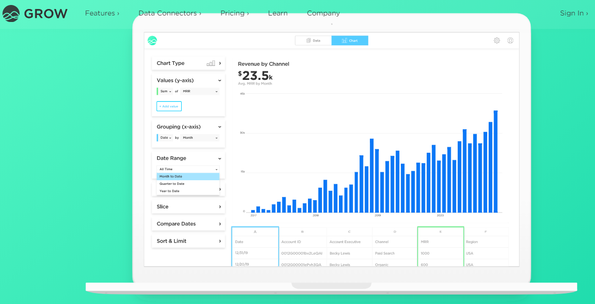
5. Grow
- for business users only
- over 300 pre-built reports
- real-time data updates
Tools for developers
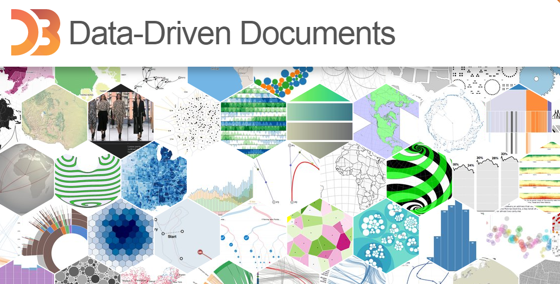
1. D3.js
- open-source JavaScript library
- complicated interface
- powerful and flexible
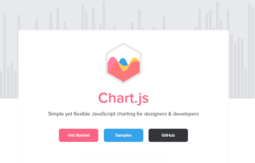
2. Chart.js
- open-source JavaScript charting library
- mixed chart types
- apply out-of-frame animation
3. Ember Charts
- open-source charting library
- focuses on graphical interactivity
- strong error handling capability
5. Highcharts
- open-source charting library
- available for free for personal learning, personal websites and non-commercial use
- can be used on all mobile devices and browsers
Resume
Reducing complexity by relying on a visual layout and enhancing problem-solving capabilities is the fundamental goal of visualizations. Therefore, when choosing data visualization tools, you need to remember about functionality and simplicity. Most data visualization tools include free trials (unless the entire tool is free), so it’s worth taking the time and trying several before choosing one solution.